FireAware App
Project Overview
Residents of wildfire-prone states in America are in need of a single-stop application to provide them with timely and relevant information about wildfire conditions in their area. This conceptual project is a mobile first design, with plenty of potential to expand in functionality and across other devices.
Role
Product Designer
Timeline
12/2022 - 1/2023
Tools
Adobe XD | Maze.co | Google Forms
Background
The Problem
Climate change is causing rising temperatures and droughts that are fueling an increase in wildfires throughout the western United States. According to the Western Fire Chiefs Association, the states most prone to enduring large and destructive wildfires include Alaska, Arizona, California, Colorado, Idaho, Montana, New Mexico, Nevada, Oregon, Utah, Washington, and Wyoming. Residents in these areas are in need of a quick, simple way to receive potentially life-saving information and alerts during wildfire emergencies.
The Goal
To design an app that will provide wildfire maps and alerts in a direct and accessible way for individuals living in areas of the United States that encounter seasonal wildfire dangers.
The Product
The FireAware app will be a resource for wildfire tracking and emergency planning for those individuals that live in wildfire-prone areas of the United States.
Target Audience
Individuals living in areas of the United States that encounter seasonal wildfire dangers.
User Research
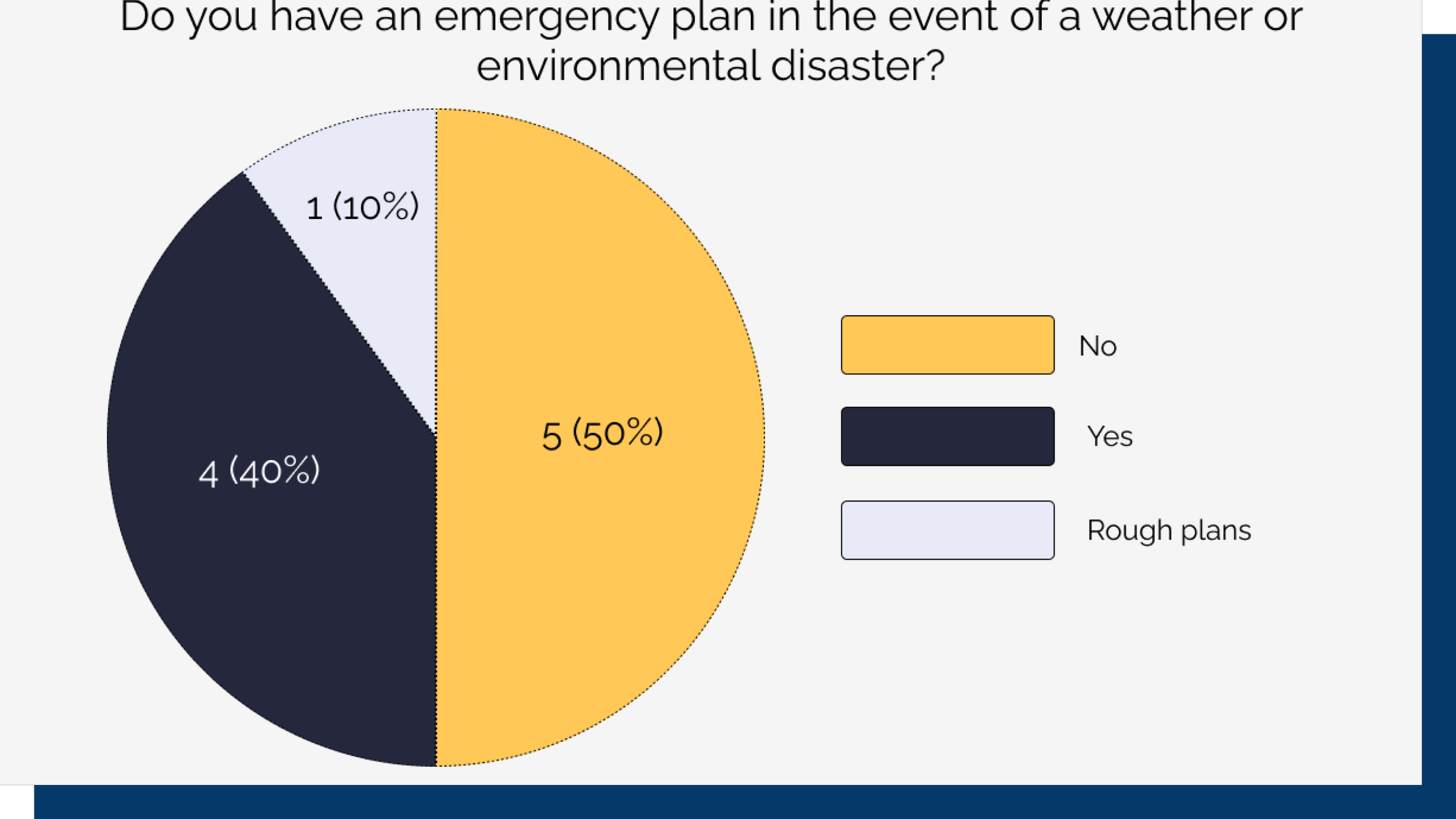
I conducted preliminary user research via an online survey. The survey was used to collect information such as how users received emergency alerts, if they lived in wildfire-prone areas, if they had an emergency plan in place, and how they located information during environmental/weather emergencies. The 10 respondents were aged between 22-49 and had a wide variety of family compositions.
Market Research
My next step during this phase of the design process was to select a few of the wildfire apps and websites in the current market and carefully examine them by conducting a competitive analysis. I explored two direct competitors and one indirect competitor.
This research brought to light a number of opportunities for the FireAware app. While the Ready for Wildfire website was rich with information and guidance, it is tailored specifically for a single state. The other offerings serve the entire country, but were focused on selling a product rather than being a primary resource for wildfire information and preparation.
Pain Points
After interviewing users and completing a competitive analysis, I moved onto consolidating that information to define the problems users currently have with obtaining wildfire information and guidance. These pain points are:
State-Specific Information
Apps and websites offer state-specific information that may not apply to all users within the USA.
Scattered Resources
Users must find and use a variety of websites to obtain guidance about wildfires and wildfire preparation.
Emergency Plan
Users want to be prepared for emergencies, but find it difficult to create an emergency plan.
Required Signups & Paywalls
Users must sign up for apps and sometimes must pay a subscription fee.
User Personas & Journeys
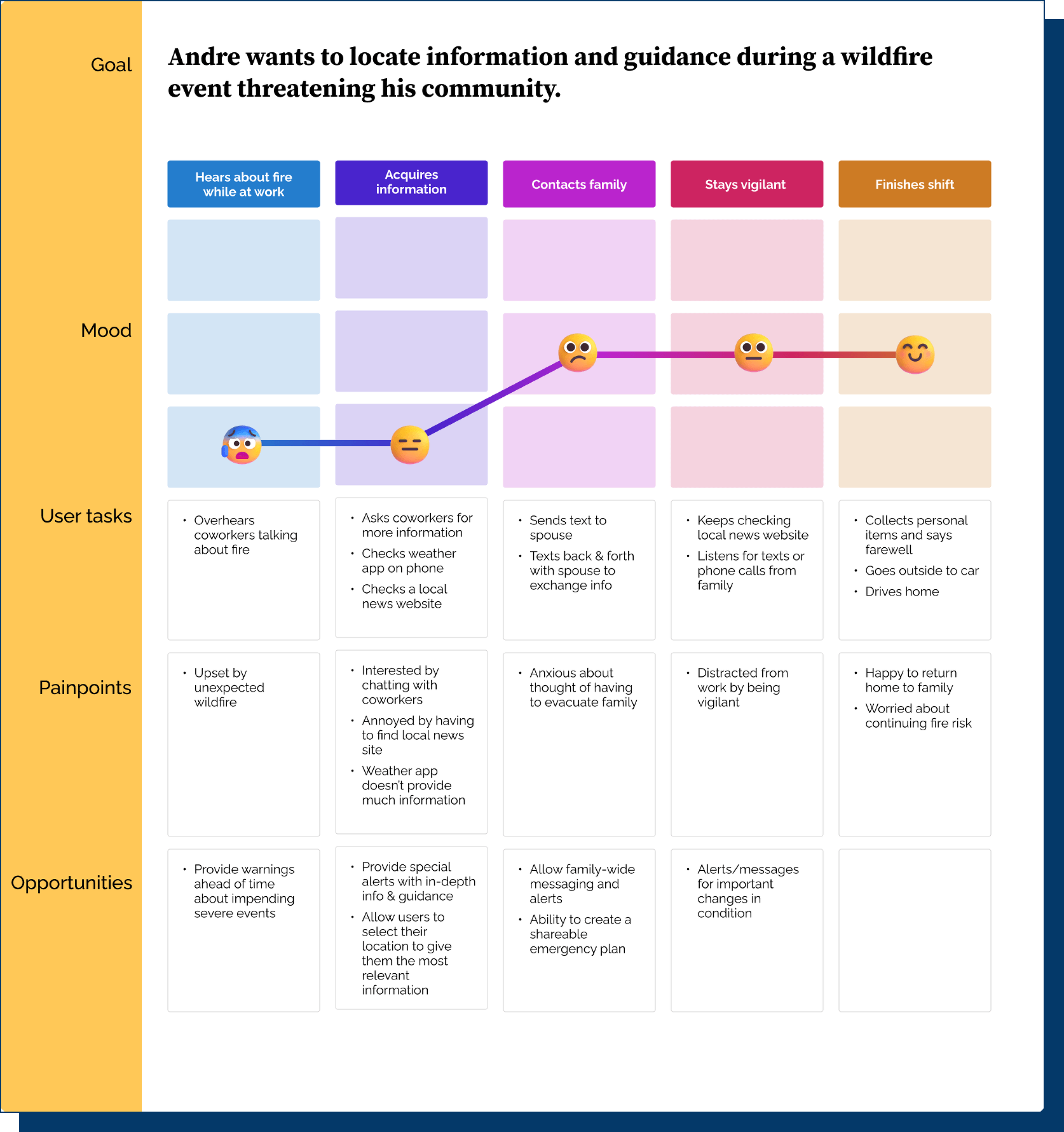
After synthesizing all of my research and identifying pain points and opportunities, I built user personas to represent two different types of user groups that would utilize the FireAware app. Carmen symbolizes users that want to be prepared for emergencies, but need reliable guidance. The second persona, Andre, represents the user group that needs information during a wildfire emergency.
Starting to Design: Paper to Prototype
Once I completed research on the problem and identified user pain points, I moved onto generating solutions. I knew that I needed to design an app that would be simple to use and accessible to all users that live in wildfire-prone areas. I also wanted to include emergency preparation guidance, but I decided to keep my focus on designing the primary purpose of the app: Giving users up-to-date wildfire information that applied to their location.
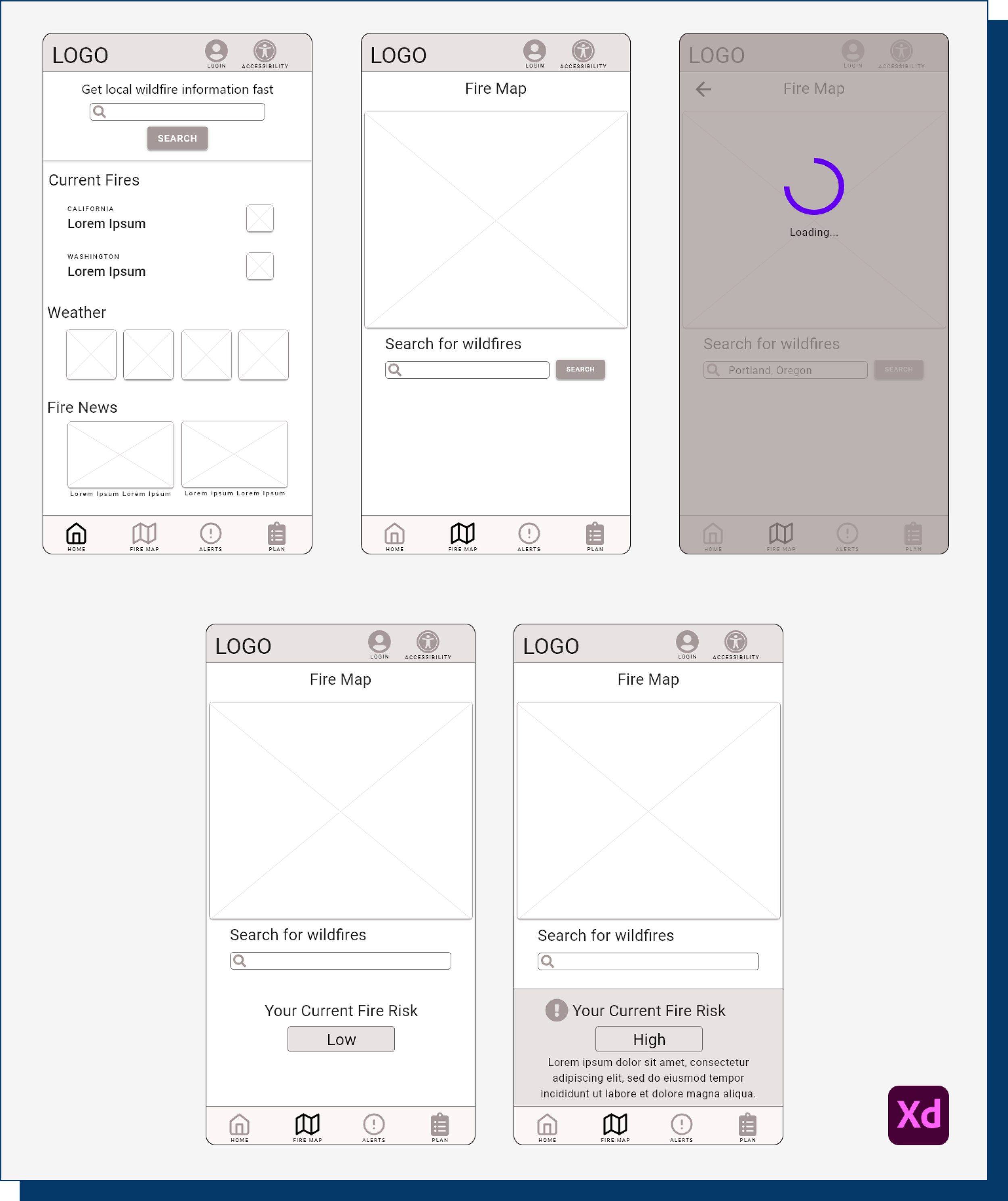
I sketched out my initial design ideas, breaking things down page-by-page. This helped me compile a list of necessary elements for each page and the app overall. Once I had a good feel for the pieces I had, I moved onto creating paper wireframes. As I drew them up, I starred features that would provide a great user experience. I also prioritized features that quickly and clearly displayed wildfire information. After I had created a number of wireframes per page, I analyzed them and compiled all of the best features into a single digital wireframe.
Usability Testing
Once I finished creating the low-fidelity prototype, I was eager to get to usability testing. I felt that it was important to start with testing the most basic function of the app: Searching for a wildfire. Using that focus as my guide, I wrote up a research plan and created an unmoderated usability test using Maze as the platform.
Study Details
Study Type: Unmoderated
Location: Remote, United States
Participants: 6 participants (2 female, 4 male between the ages of 25-70)
Length: 10-15 minutes to complete
Structure: Welcome & introduction screen • Participants complete 3 tasks using the low-fidelity prototype • Follow-up questions after completion of each task
This initial usability test yielded a bounty of great feedback and suggestions. All 6 testers felt positively about the FireAware app. All participants also felt that the app concept is useful. However, there were a few issues brought to light that needed to be addressed:
#1 Navigation
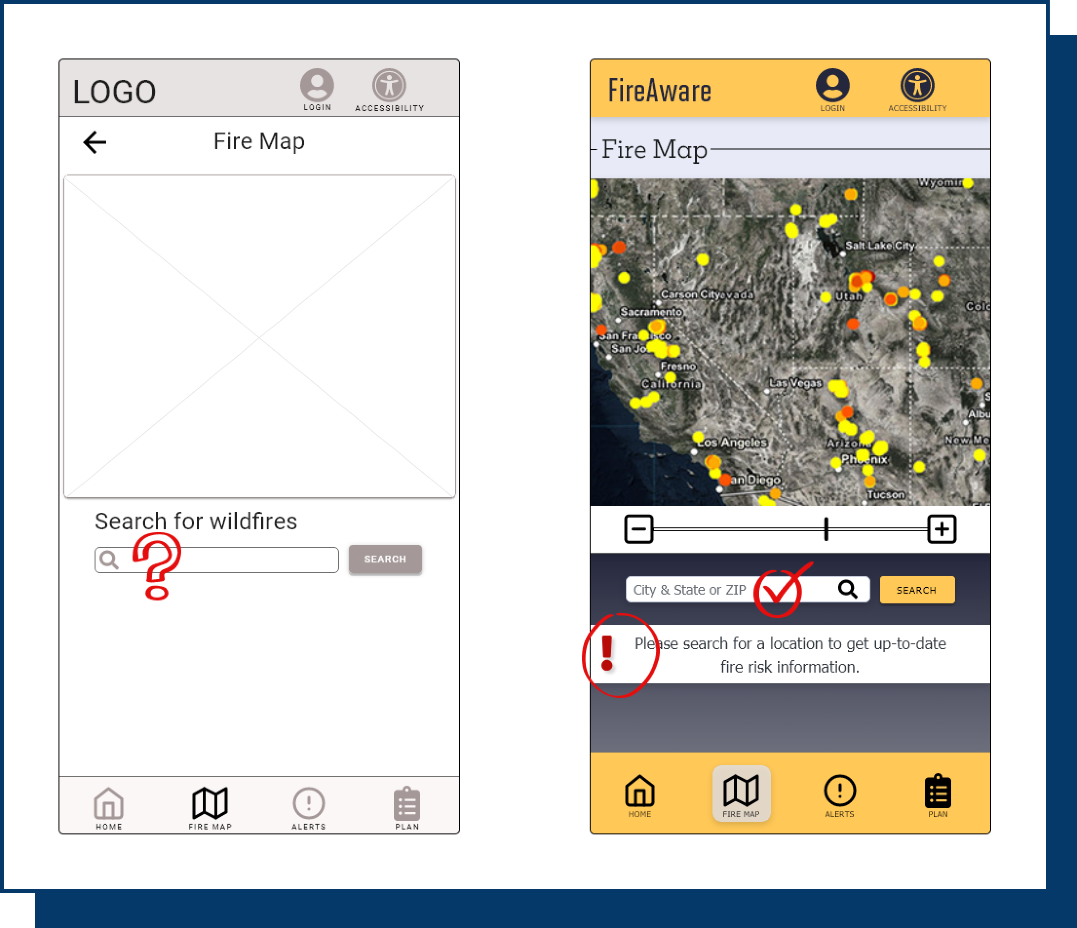
Users had troubles locating the search bar on the dashboard page.
#2 Search Woes
Users were unsure of what to type into the search bar and needed guidance.
#3 More Features
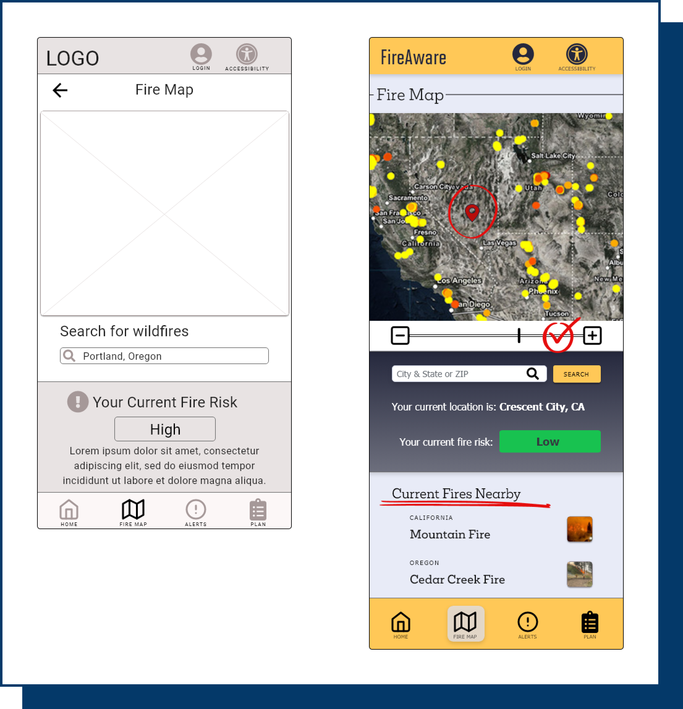
Users expressed a desire for additional features such as a new-user demo or the ability to mark fires on the map.
Iteration
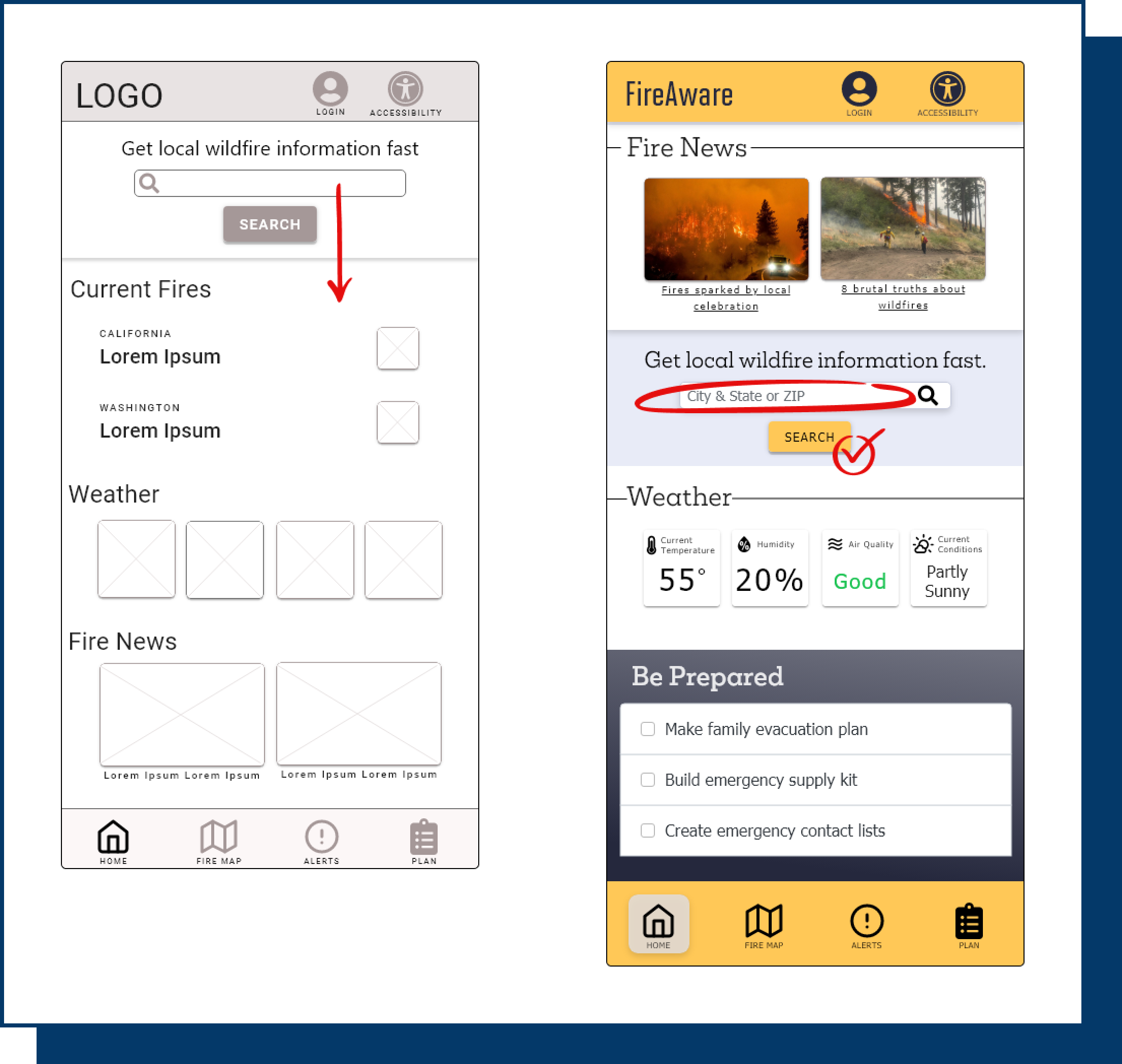
Based on the insights for the usability study, I relocated the primary search bar into a central location and applied a bright yellow to the search button to draw the user’s attention. I also added placeholder text to the search bar to help inform users of its purpose.
I revised the fire map in a number of ways. I added a zoom in/out slider to the map, helper text under the search bar, and placeholder text to the search field to give users clearer guidance on how to interact with this screen. In addition, I included a section featuring current fires nearby. My goal was to give users plenty of useful information at a single glance.
Mockups & High-Fidelity Prototype
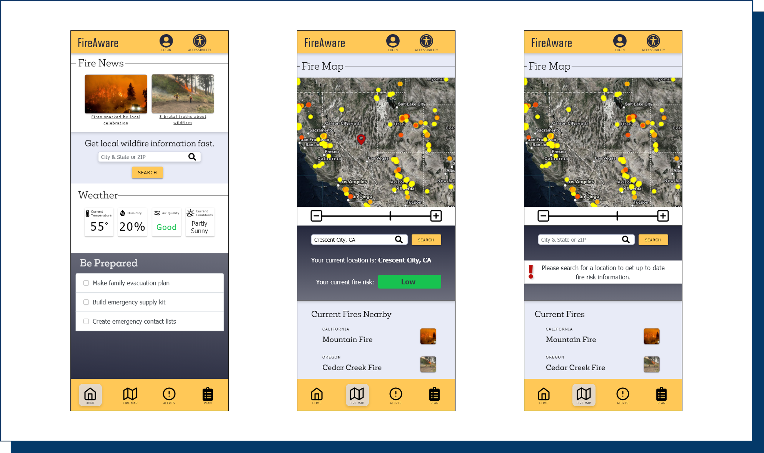
Based on the feedback from the usability test, I felt confident in moving onto the next phase of design: Creating mockups and a high-fidelity prototype. The design for the FireAware app is the culmination of all of the research and user feedback I gathered throughout the entire design process. Users appreciated the clean, simple UI design. I augmented that with a bold color palette and a selection of easy-to-read typefaces.
Next Steps
I feel like I’ve barely scratched the surface of what the FireAware app could be. While I feel like the very basic functionality is sound, there are so many more things that could be added to the app to truly make it a one-stop resource center for wildfire preparation and awareness. Some of the additions include:
Emergency Prep Checklist
Create user-friendly, step-by-step emergency prep checklists such as a family action plan and an emergency supply kit checklist.
Alert Function
Add the ability to create emergency contact lists. Add an alert function so users can be alerted about nearby fires, be reminded of prep tasks to be completed, and send alerts to contacts.
Contacts
Add the ability to create emergency contact lists. Add an alert function so users can be alerted about nearby fires, be reminded of prep tasks to be completed, and send alerts to contacts.
Outro: Lessons Learned
Every single project is a learning experience. Here is what I took away from my time designing the FireAware app:
This project more directly allowed me to realize the impact apps have on our lives. Users shared that they thought the FireAware app was a useful product. It is clear that there is a desire for technology that can help people before, during, and after environmental disasters.
I deepened my knowledge of Adobe XD, including becoming quicker at wireframing and prototyping.
It had been a very long time since I had last written a survey, so this project was an awesome refresher and real-life crash course in that aspect of UX research.
Moderated usability tests seem to give a better quality of feedback than unmoderated ones, however they take a lot more time to conduct.
And I made some mistakes along the way as well….
My survey writing wasn’t great. I received feedback from respondents afterward, and they expressed confusion with some of the ways I structured questions.
My survey respondents and usability testers were not all residing in wildfire prone areas of the United States. If I were to do this project again, I would earmark more time for the research phase in order to obtain users that strictly live in wildfire hot spots.
Unmoderated usability studies are useful and convenient, but in this case I wish I would have been able to do a moderated study instead. I think a moderated usability study would have allowed me to gain a deeper understanding of how users interacted with the prototype.


